Lately, there has been a notable surge in these errors appearing on Google Search Console, particularly in the context of YouTube videos. Given the numerous questions I’ve received in the Community, I felt it was essential to share this article with you, as I believe an informative piece on this topic would be beneficial.
When you embed YouTube videos on your website, Googlebot can’t actually play the video content, but it recognizes it as a video element. It roughly evaluates the video as follows:
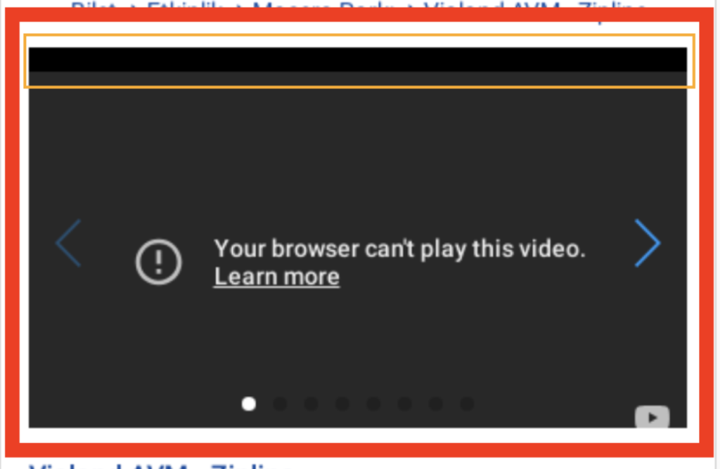
The red area represents the location of the video iframe. If you notice an orange thin line, it indicates that part of the video within the iframe has shifted.
The iframe’s dimensions don’t precisely match the specified scale. This leads Google to assume that some of the video content is not visible.
The original video dimensions are 320×180 pixels with a 16:9 aspect ratio for mobile. Now, let’s calculate how these measurements translate to using 30vh on your website. For the iPhone 12 Pro (with a height of 844px), the appropriate pixel-to-vh ratio would be as follows:
The 100% width value appears to be 358px for this device. When we calculate it with a 16:9 aspect ratio, your vh ratio should ideally be 23.9. However, you’ve used 30vh on your site.
This discrepancy results in a 52-pixel shift, which Googlebot interprets as content outside the video display area. If Googlebot had the capability to play the video, YouTube would automatically adjust the video size, resolving this issue. But until Googlebot gains this functionality, it’s crucial for developers to meticulously calculate and set these proportions on their websites.
Here’s a detailed calculation for you:
Suppose the viewing device’s height on your website is 744 pixels, and you’re using a video width of 320 pixels. To maintain a 16:9 ratio for the video iframe, the height should be 180 pixels. When you want to express this height in vh (viewport height units), you need to consider the screen height.
Here’s how you calculate it:
744/180 = 4.13333
To convert this into vh: 100/4.13333 = 24.19vh
Since the height of each device varies, this calculation helps you find the appropriate value. However, it’s worth noting that this method is not recommended because it can potentially block content.
A best practice would be to calculate dimensions in pixels. For instance, if you set the video width as 320px, the height would always be 180px. When determining the height for a 800px wide video with a 16:9 ratio:
You would calculate it as: 800/16*9 = 450px.
WordPress Solution
In a discussion about the issue on https://support.google.com/webmasters/thread/237795154/how-to-fix-the-problem-of-video-outside-of-viewport-before-they-were-not-when-i-published, community member ezaz provided the codes that will automatically establish a 16:9 ratio. I’m passing them along to you here.
<figure class=”wp-block-embed is-type-video is-provider-youtube wp-block-embed-youtube wp-embed-aspect-16-9 wp-has-aspect-ratio”>
    <div class=”wp-block-embed__wrapper”>
       [Youtube Embed Code]
    </div>
</figure>
HTML & Style Solution
If you wish to customize your own style, we’ll utilize two divs for the embedded video. The style properties for the first div are “position: relative;“, “width: 100%;“, and “padding-top: 56.25%;“. For the style attribute, we set the value to 56.25%, following the 16:9 aspect ratio formula (9 / 16 * 100).
As for the sub div, it should assume an exact position with “position: absolute;“, “top: 0;”, “left: 0;” to perfectly fit within the parent div. To eliminate any padding or margin, set “width: 100%;” to fully occupy the specified area, and “height: 100%;” should be assigned as its value. The complete code output should look like this.
<style>
.container {
position: relative;
width: 100%;
padding-top: 56.25%; /* 16:9 aspect ratio (9 / 16 * 100) */
}
.content {
position: absolute;
top: 0;
left: 0;
width: 100%;
height: 100%;
}
</style>
<div class="container">
<div class="content">
<iframe src="https://www.youtube.com/embed/OWel_9OHjxI?si=hVdBmaCU1LDba0Ub" title="YouTube video player" frameborder="0" allow="accelerometer; autoplay; clipboard-write; encrypted-media; gyroscope; picture-in-picture; web-share" allowfullscreen style="width: 100%; height:100%;"></iframe>
</div>
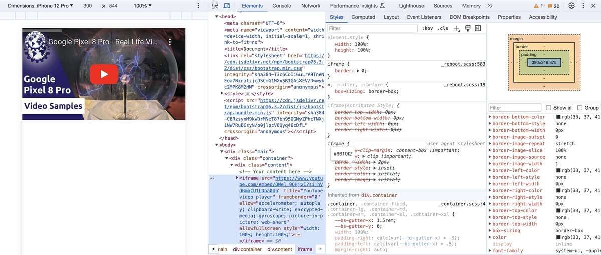
</div>As depicted in the screenshot below, this code has set the video’s height value to 219,375 pixels, following the formula 390/16*9. This adjustment aligns with the 390px width of the iPhone 12 Pro device.